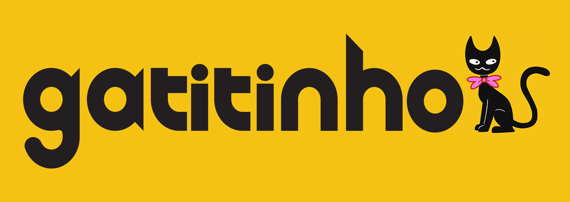
Typeface for "Gatitinho"

Its optimal application is in dark gray over a yellow background (#eec346).
Summary:
"Gatitinho" (2023) is an animated short film about a pampered domestic cat who ventures out into the streets.
This was my first take on Typography. In it I seeked to allude to the character's most striking visual features: its pointy ears and flowy tail.

Only the the 7 glyphs contained in the movie's title were designed. In keeping with the character design:
- The letters “g”, “a” and “h” have pointy tips, like the cat's ears.
- All letters incorporate curvature as a visual motif.
- The “g” has a rounded tail-end.
- It's consistent and legible.
- Program used: Adobe Illustrator.
             .,/#   /.
         &%&@@@@@@@&&&&@&@/
       /@&@@@@@@@@@@&@@@@@@@@
     *(@@@@@@@@@@@@@@@@@@@@@@@@@
    %#@@@@@@@&%(,,./(#&@@@@@@@@@&
    &&@@@@##.    ....*/(%@@@@@@@&
    &&&&@&&.... ...../#(#%%@@@#&#/
   ##@@&&&(/#/..,/////((####&&&@#%
    &&@&&&(%#&&&(##,/#&@@# .(%@&&&
     &#&&@//#&&#////##### /* #/&,
    . &/&#//*//*//(//////. . &#
       /,#.//*..(////#//..  ,
       * @#.///*/##&###//.  %
          ,* */#%@@&&&%/.  /
           @/ ,#//(#((#/.
            .//####////,/..@
           .&#/#*%//*...///*.
        .. ,./#(/#///*.*(&(   (,
   ..*.../ //.//%##(/#%&#./..//,/./ ,
/.///(////#//(#(#%#&@&%#/../##/,.(./*/
© Theodoro B. C., 2024. All rights reserved.